Creating Faux Bokeh Backgrounds in Photoshop Tutorial
Compatibility:
Photoshop CS to current version

This tutorial will walk you through how to create a faux bokeh background in Photoshop. Bokeh is a Japanese term used to describe the qualities of the area of a photo that is out of focus, and can be used to help draw your eye to the subject of the photograph.
Tools Needed:
Bokeh Photoshop & GIMP Brushes
This tutorial is made for Photoshop users, but if you’re an Elements or GIMP user, you should still be able to follow along — though the steps will not be exact for you.
The horse image used for this tutorial comes from Capgros at the Stock Exchange. The rest are mine.
1. First, find the photo you’ll be using to follow along. Now, take a good look at that photo. What it looks like will determine which part of this tutorial you will follow.
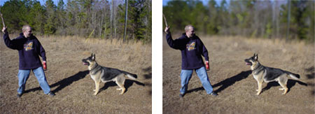
If your photo is made up of all foreground and background, like the photo on the left below, then follow steps 2-13. If your photo has your subject completely surrounded by the “background” of the photo, like the one on the right below, follow steps 2-11, then jump ahead to the alternate steps 14-17. I will tell you when to skip ahead in the course of the tutorial, so just go get it in your mind whether or not you need to use the alternate steps or the regular steps, and get started.
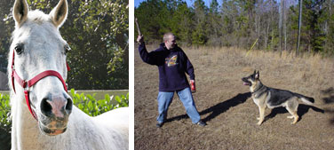
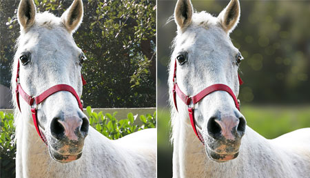
2. Here’s our “before” picture. It looks like a regular photo, with the horse in the foreground and the leaves, etc. behind it. The horse is already fairly prominent in this example, whereas there will be other photos that are in need of the bokeh effect much more than this one is. However, it will still illustrate the point.
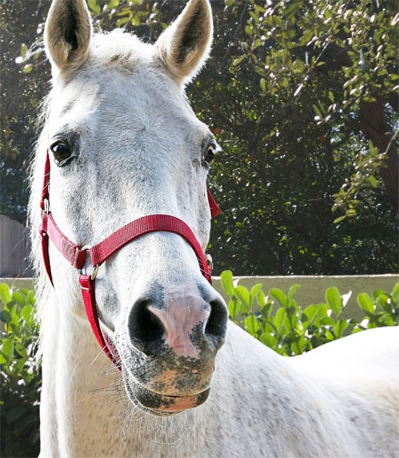
3. The first step is going to be to isolate the foreground from the background, so that we can blur the background only.
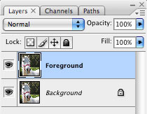
Open up your Layers window (if it’s not open, choose Window > Layers to open it). Right click on the background layer and choose “Duplicate Layer.” If it gives you a chance to, type “Foreground” for the layer name. You should now have a layer just above the Background. If you didn’t rename it to “Foreground” before, right click on that top “Background copy” layer and choose “Layer Properties” to rename it. Under Name, type “Foreground” and hit OK. Your layers window should now look something like this:
4. In this next part, we’re going to basically remove the background from the “Foreground” layer, but we’re going to do it using a layer mask. Those of you not familiar with how Layer Masks work, here’s your chance to learn!

Click on the “Foreground” layer. Now, near the bottom of the Layers window, find “Add a Layer Mask” and click on it. It should create something that looks like this:
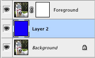
5. Now click on the Background layer. I’m going to have you make a bright blue temporary layer between these two, to help make it easier to “cut out” the foreground part of the image. Click on the “Create a New Layer” button near the bottom right of the layers window (or CTRL-SHIFT-N(PC) / CMD-SHIFT-N(Mac)). Choose a bright blue color for your foreground color by clicking on it and choosing the color from the palette. Then select the paint bucket tool (”G” – or right click on the Gradient Tool to switch from it to the Paint Bucket), and click once on the canvas anywhere. You won’t see any change yet, because it’s still hidden by the Foreground layer. For now.
6. Click back on your Foreground layer, but click specifically on the white square (the mask) part of it. Now click on the image part of the layer, just to the left of it. See how it highlights whichever part of the layer is currently active? That’s how you know whether you’re editing the photo part of that layer, or the mask part of that layer.
This next part is, by far, the most time consuming part of this tutorial. But, any of you photo manipulators out there already know how very un-fun it can be to remove backgrounds. There aren’t many tips that I can give you on how to get it just right. It’s a matter of practice, and patience. There are some programs out there that will help you, and so if you have them, by all means use them.
Let me explain to you how layer masks work, for those of you that haven’t used them before. Any black on the layer mask will make the corresponding part of the image show up as transparent. Let’s try something, just so you see what I mean. Make black your foreground color, and then select the mask part of the Foreground layer by clicking on it. Take a brush, any brush, and paint a stroke of black across the canvas. As you’ll see, wherever that black shows up, the blue background is now showing through. CTRL-ALT-Z to undo (CMD-OPTION-Z on Mac).
Click once on the photo thumbnail on the Foreground layer to make sure it’s selected. You now have a few options. If you have a tablet and/or a steady hand, you can use black to “paint out” the background by hand, using black on the mask to cover the entire background portion. Probably the easiest way to do this, though, is to use the magic wand tool.
Select the magic wand tool (”W” or right click on the direct selection tool to switch to magic wand). If your background is mainly made up of one color, you can try moving the “tolerance” (located on the top bar, just under the main menu) up to about 75% or so. If it’s not, I’d suggest keeping it in the 30-50% range. Use it to click on various portions of the background, making sure that you ONLY get background. Hold SHIFT, and select the next part of the background. Keep going like this, until you get a decent chunk of your background selected, then click once on the mask part of the Foreground layer. Using the paint bucket tool and with black as your selected color, click once within that selection to fill it with black. Keep doing this, switching back to the photo part of the Foreground layer to make your selections, then back to the mask part of the layer to fill them in with black. As you use the paint bucket to fill the selections in with black on the mask, the blue layer should start showing through, replacing the background of the photo.
Here’s what mine looks like. Notice that I’ve made a mistake, and ended up taking a part of the horse’s eye along with the background on accident. Fear not! That’s the great thing about using masks, rather than simply deleting the background. You delete it, and it’s gone. You use a mask, and it’s as easy as taking some white and brushing over the eye area to fix it!
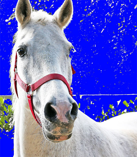
7. Most of our background is gone, leaving those ugly chunky parts behind. Well, that’s easy enough to fix. This is the point where I usually grab a decent sized brush and go in there on the mask part of the layer, painting black over all those small spots to remove them entirely. Use a smaller brush to help clean up the edges of the foreground, remembering to use white to make a part visible, and black to make it transparent.
Tip: If you need to see what you’re supposed to be painting, click on the small eye to the left of the blue layer to hide that layer and see what’s beneath it, then click on the eye again to make it visible once more. You can even paint with it hidden if that makes it easier for you in some parts. When you’re done, you should have something that looks like this (I’m also including a screenshot of my layers window, just so you can see my mask):
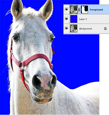
8. Now it’s time to go in there and remove that ugly blue background. Right click on that blue layer and choose “Delete Layer” or click on the trashcan on the bottom right of the layers window to delete it.
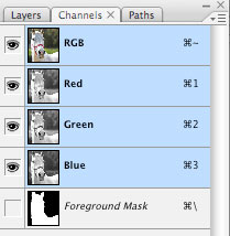
9. Click on your Foreground layer to be sure it’s active. Open the Channels window by choosing Window > Channels. At the very bottom, there should be a Foreground Mask layer. Click on the small box to the left of that layer to make it visible (where the eye would be, if there were one showing), then click on the layer to make it active.
Choose Select > Color Range from the main menu. A window will pop up, and your mouse will turn into an eyedropper. Click within the black area of the mask (the background of the photo). Set the “Fuzziness” slider to around 80 or so, somewhere in the middle. Hit OK. The background of the photo should now be selected.
Click on the small eye to the left of the Foreground Mask layer in the Channels palette to hide it once again, and then switch back over to your Layers Window. (If your Photoshop is still set up to the default configuration, they will be in the same window together, with tabs up at the top. You can just click on Layers there, or choose Windows > Layers, or hit F7.)
10. Click on the Background layer.
CTRL-C (CMD-C on Mac) to copy. CTRL-V (CMD-V on Mac) to paste. You’ve just made a new layer with JUST the background on it. Right click on that layer and choose Layer Properties, then name it Background2. We’re going to blur this layer to take it out of focus.
Why do we make this new, Background2 layer? Because if you were to blur the Background layer, you would also be blurring the subject. Granted, it’s hidden behind the top layer, which also contains the subject. But with my example, since the horse is white, when I blurred the Background layer, I would get this odd, white halo effect around the horse… because of the horse being blurred into the background. We don’t want this.
Blurring can do some odd things around the edges of the blur, if there’s nothing there to “blur into” – so we’re going to need to extend the edges of the background, too.
11. Click on the small eye on the left side of the Foreground layer in the layers palette to make it invisible for now. Then click on the Background2 layer to make sure it is selected. Select the Smudge Tool (”R” – or right click on the Blur Tool/Sharpen Tool to select the Smudge Tool from the 3 choices). Select a medium sized round brush, and put the Strength (up on the top bar, under the main menu) on about 65%. Now go along the edges of the Background2 layer, smudging the edges of it inward.
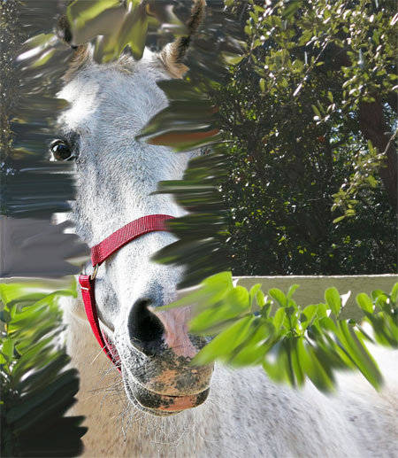
Yes, it’s going to look a little funny for now. But don’t worry, it’ll be blurred beyond recognition in a few moments.
*** If your photo has the subject surrounded by background and you need to use the alternate steps (see step 1 for an explanation), skip ahead to step 14 now!! Otherwise, continue on to step 12.***
12. Click on the small eye next to the Foreground layer once again, to un-hide it. Make sure your Background2 layer is still selected – if it isn’t, click on it! Choose Filter > Blur > Gaussian Blur from the top menu. What radius you select here is really up to personal preference (and the size of your canvas). You can move the slider up and down and see the effects that it has on your canvas. I would suggest choosing a decently high radius, so that the background becomes fairly indistinct.

13. Now load up the Bokeh Brushes. Use the Eyedropper Tool (”I” – or right click on the Color Sampler or Ruler Tools and choose Eyedropper from the 3 choices) to pick up one of the very lightest colors from your background. Any color of your choosing. You may even want to do a few different colors, it’s up to you and what your photo looks like. I chose one of the very lightest greens from my foliage background.
Click on the “Create a New Layer” button on the bottom right part of the Layers Window (or CTRL-SHIFT-N/CMD-SHIFT-N). Name it Bokeh. On that layer, you’ll add the bokeh effect.
You can either use one of the pre-made, scattered brushes or use one of the “painting” brushes and click on the canvas in the places where you’d like the bokeh to show up. Each brush will have a different effect, so find the one you like the most. In this example, I’ve used two of the scattered brushes, one round and one polygon shaped. Note: Bokeh will usually correspond to the most lighted areas of your background.
I would suggest turning the opacity of that Bokeh layer down (on the top right of the Layers Window) to perhaps about 40-60%, depending on what bokeh brushes you use. Or, you can leave it how it is if you want the bokeh to be really obvious. It’s totally up to you.
That’s it! Play around with the brushes and the colors, and enjoy! Let me know in the comments below if you have any problems.
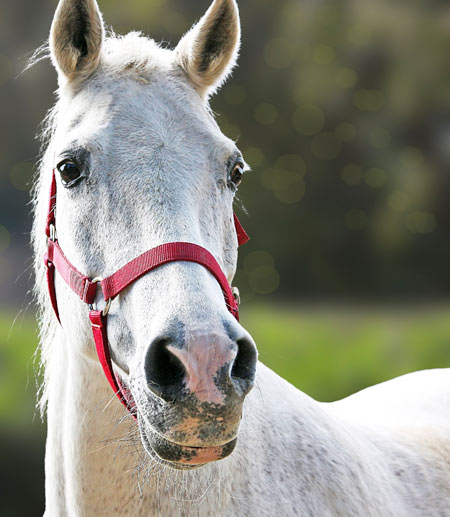
14. You should only be following these next steps if your photograph has the subject completely surrounded by background. You should have followed steps 1-11 above, then skipped down to here.
We’re going to blur the background differently in this version, because part of the background is actually our foreground! So, here’s how to do that.
Click on the Background2 layer. Choose Filter > Blur > Gaussian Blur from the top menu. The radius is up to you, and will depend on the size of your photo. Play around with the slider until you get it to be looking fairly blobby and indistinct, but not all completely mushed together. Something like this:

15. You can see why we need to modify this, because that just looks odd. So, add another layer mask, this time to the Background2 layer by clicking on the “Add Layer Mask” button on the bottom of the layers window.
Select the Gradient Tool by right clicking on the Paint Bucket Tool (which we used earlier) and choose the Gradient Tool from the 2 choices. Just below the top menu, you should see the various settings for the Gradient Tool.

Click on the small arrow just to the right of the larger gradient thumbnail (it’s highlighted in red in my photo above). It will open up a window of various gradient colors and styles. (Note: Before doing this next step, if you’ve created any custom gradients and have them currently loaded in your gradient palette but haven’t saved them, make sure you save them first!) Click on the small arrow on the right side of that window, and then choose “Reset Gradients.” It’ll ask if you’re sure, and choose OK.
16. Third from the left on the top row should be a black to white gradient. Select it by clicking on it.
Click on the mask part of the Background2 layer to make it active. Starting right around the feet of your subject(s), click on the canvas and drag upwards. Let go about 3/4 of the way up the photo. If you don’t get it right the first time, play around with it… where you make your gradient will vary greatly from photo to photo. You can just keep redoing it until it looks right.
You see what you’re doing here? You’re making the background slowly blur out as it gets further away. The foreground should be in focus, along with our subjects. The background should be blurry. Now, with mine, I thought that the blurry part was a bit too transparent, showing some of the background behind it, in focus. So, what I did was I right clicked on that Background2 layer and chose “Duplicate Layer” to thicken it up a bit. Mine now looks like this:
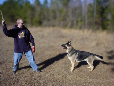
17. Now load up the Bokeh Brushes. Use the Eyedropper Tool (”I” – or right click on the Color Sampler or Ruler Tools and choose Eyedropper from the 3 choices) to pick up one of the very lightest colors from your background. Any color of your choosing. You may even want to do a few different colors, it’s up to you and what your photo looks like. I chose one of the very lightest greens from my foliage background, a light blue from the sky, and a lighter straw color for the field.
Click on the “Create a New Layer” button on the bottom right part of the Layers Window (or CTRL-SHIFT-N/CMD-SHIFT-N). Name it Bokeh. On that layer, you’ll add the bokeh effect.
You can either use one of the pre-made, scattered brushes or use one of the “painting” brushes and click on the canvas in the places where you’d like the bokeh to show up. Each brush will have a different effect, so find the one you like the most. In this example, I’ve used two of the scattered brushes, one round and one polygon shaped. Note: Bokeh will usually correspond to the most lighted areas of your background.
I would suggest turning the opacity of that Bokeh layer down (on the top right of the Layers Window) to perhaps about 40-60%, depending on what bokeh brushes you use. Or, you can leave it how it is if you want the bokeh to be really obvious. It’s totally up to you. Here’s how mine looks:

Note: If the subject of your photo is more toward the background, then you may want to blur out the “foreground of the background”, leave the middle sharp, and then blur out the very back of the background. In other words, it should be sharp around the feet or bottom of your subject, then a bit blurry in front of that and blurry in back of it. I’ll show you what I mean.
Click on the mask part of the Background2 layer to select it. Look up at the gradient thumbnail on the top bar, just under the main menu. The same one that we clicked the little arrow next to last time. This time, click ON the gradient part. It should open up a window that looks like this:
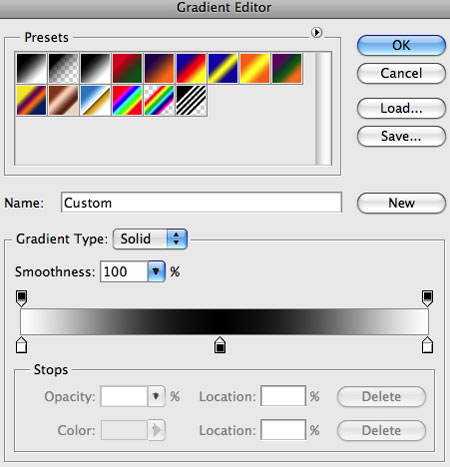
Yours should still go from black to white. You want to make it look like the photo above. Click on the small box on the bottom left of the gradient bar, then click on the box just to the right of “Color:” and make it white. Do the same thing with the box on the lower right of the gradient – click on it, then click on the Color box and make it white. Then click just under the gradient somewhere in the middle. It will make another box there. Click on that box, then click on the Color, and make that one black. Your gradient should now look like mine.
Make your gradient the same way that you did before, except instead of clicking at the feet/bottom of the subject and dragging upwards, click near the very bottom of the photo (or below it, even, if you zoom out and make the canvas window bigger than your photo – this is how I did it) and drag upward until you’re a bit above the feet/bottom of your subject and then let go.
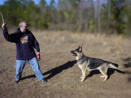
See how mine looks now? It’s sharp around the feet of my subjects, a little blurry in the foreground of that, and gets very blurry toward the back. This photo didn’t need it, really, but some photos will. If the subjects had been standing more toward the back of that field, they would most definitely have needed this step. Play around with the gradient and see what looks best.
That’s it! Let me know in the comments below if you have any problems. Here’s some before and after photos, side by side:
